Pareto Chart Tool Homework Help
Pareto Chart Tool
Pareto chart is also termed as Pareto analysis. This chart visually depicts the relative importance of problems or conditions. It is based on the Vilfredo Pareto’s 80-20 principle, according to which major effect is the result from a few causes. If the causes for the defective output are identified and recorded, it will be observed that the 80 percent of effect is due to 20 percent of causes.
Procedure for developing Pareto Chart is given as follows:
Step 1 : list the activities or causes in a table and their frequency of occurrence.
Step 2 : place these causes in descending order of magnitude of frequency.
Step 3 : calculate the total for the complete list of observation. Then, calculate percentage of the total that each cause represents. Add a cumulative percentage column to the table.
Step 4 : draw Pareto chart by plotting the causes on the horizontal axis and the cumulative percentage on the vertical axis. The cumulative percentage from all the causes can be shown by drawing cumulative curve on the cumulative points.
Step 5 : On the same chart, plot the bar graph with the causes on the horizontal axis and percentage frequency on the vertical axis.
Example of Pareto Chart
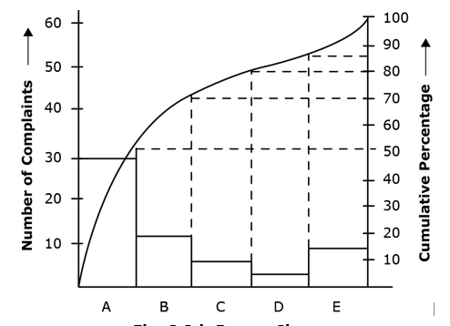
Consider, sixty customers have reported five different types of complaints, those are A, B, C, D, and others. The numbers of complaints for each type are 30, 12, 6, 2, and 10 respectively. These data can be used for calculating the cumulative total, percent of overall total, and cumulative percent as shown in Table . As shown in the figure complaints A and B are the causes for 80 percent of the total complaints.
|
Type of Complaints |
Number of Complaints |
Cumulative total |
Percent of overall total |
Cumulative percent |
|
A |
30 |
30 |
50 |
50 |
|
B |
12 |
42 |
20 |
70 |
|
C |
6 |
48 |
10 |
80 |
|
D |
2 |
50 |
3 |
83 |
|
Others (E) |
10 |
60 |
17 |
100 |
Chart:

Another of Pareto Chart
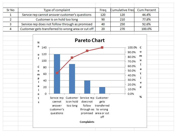
Create a Pareto chart based on the following information.
|
Customer Complaints |
Frequency/Week |
|
Customer is on hold too long |
90 |
|
Customer gets transferred to wrong area or cut off |
20 |
|
Service rep cannot answer customer's question |
120 |
|
Service rep does not follow through as promised |
40 |

Project Management Tutorials
- Activity Based Costing
- Basic Quality Tools
- Benchmarking Process
- Cause and Effect Diagram
- Project Activity Diagram
- Project Charter
- Project Contract Types
- Project Cost Control
- Gantt Chart Tool
- PERT Estimation Technique
- Work Breakdown Structure
- Motivational Theories
- Project Kick-off Meeting
- Conflict Management
- Crisis Management
- Critical Chain Project Management
- Decision Making Process
- Monte Carlo Analysis
- Negotiation Skills
- Pareto Chart Tool
- Project Management Processes
- Project Manager Goals
- Project Portfolio Management
- Project Quality Plan
- Project Scope
- Project Management Software
- Project Time Management
- Capability Maturity Model (CMM)
- Critical Chain Project Management (CCPM)
- Critical Path Method (CPM)
- Earned Value Management (EVM)
- Enterprise modeling
- Event chain diagram
- Five Forces Analysis
- Graphical Evaluation and Review Technique (GERT)
- Inclusive Management
- Product Life Cycle
- Run chart
- Six Sigma
- Aggregate planning
- Budgeted Cost of Work Performed
- Business analysis
- Business Process Modeling (BPM)
- Event Chain Diagrams
- Gantt chart
- Henry Gantt
Project Management Case studies
- Project Management Methodologies
- Implementation of Project Management
- Project Management Cultures
- Project Management Organizational Structures
- Negotiating for resources In Project Management
- Project Management Estimating
- Project Management Planning
- Project Scheduling
- Project Execution
- Controlling Projects Case Study
- Project Risk Management
- Conflict management Case Study
- Morality and Ethics Case Study
- Managing Scope Changes Case Study
- Wage and Salary Administration
- Time Management Case Study
- Industry Specific Construction Case Study
Project Management Sample Assignments
Project Management Sample Solutions
Testimonials
Very affordable projects!! And that to submit before deadlines. Thanks for helping me in my database project and raising my grades. I have been able to secure good marks in my internal assessment only because of you. Read More

