STAT20029 Module 2: Presenting data
Module 2: Presenting data
Introduction
There is a proverbial saying that ‘a picture is worth a thousand words’. When examining data sets we could just as equally say ‘a picture is worth a thousand numbers’. Most people prefer to see a picture rather than read page after page of numbers. Human beings are generally visual creatures and so it is important that we can present data in appealing and accurate ways. Whether we’re trying to explain to a client the need to cut back their spending or interpret a company’s annual report, it’s important that we can both understand pictorial summaries of data and create our own.
This week we explore ways to present data graphically. Because this is an area with much potential for misuse, it is one we should consider carefully. The media offers many examples of misleading graphs and statistics (as an exercise, after you complete this module, try looking in your local paper, a news website or watch the evening news for some examples of poor graphical displays). We are going to explore ways to produce simple, accurate and reliable graphical summaries of data and critique some poor examples. Remember that you’ll need to know how to do these calculations by hand, as well as using Excel (KaddStat is optional).
Objectives
On completion of this module you should be able to:
- graph bar chart, pie chart and Pareto chart (by hand and using Excel)
- produce stem-and-leaf plot or stemplot (by hand and using Excel)
- construct frequency distribution table (by hand and using Excel)
- plot frequency polygon, ogive and histogram (by hand and using Excel)
- produce a scatterplot and time series plot (by hand and using Excel)
- learn about use of colour, multiple panels and bubbles for multidimensional visualisation, and
- discover and describe common graphical errors, explore ethical issues related to these and explain how to overcome graphical errors.
Graphical displays for qualitative data
Pie charts
A pie chart allows data to be displayed using a circle divided into slices. The entire circle represents 100% of the data and the slices represent the percentage breakdown of categories. In general, it is more difficult to interpret the relative sizes of the categories in a pie chart than in other graphical displays (such as the bar chart or Pareto chart). A pie chart is preferred when you are most interested in comparing the proportion of the entire data set that is in each category. When the number of categories is large, a pie chart can be difficult to interpret and other graphical types would be preferred.
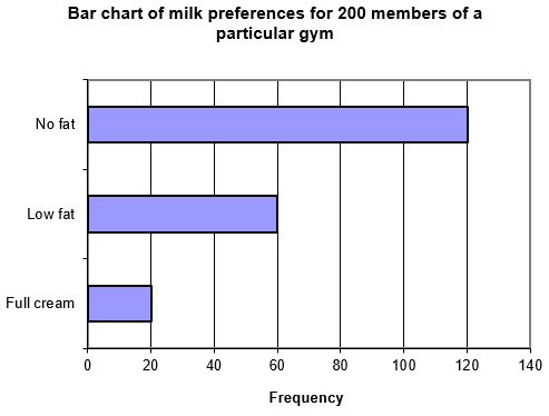
We will illustrate the construction of a pie chart by hand using a (very) simple example. A group of two hundred members of a particular gym were asked to name their preferred milk type. It was found that 120 preferred no fat milk, 60 preferred low fat milk and 20 preferred full cream milk. This information is summarised in the first two columns of the table on the next page.
Next we need to calculate what percentage of gym members fall into each of the three categories. Since there are 20 who prefer full cream milk, this corresponds to . Similarly, for the low fat category we find and for the no fat category .
Finally, we need to calculate the number of degrees that should be allocated to each category. Remembering that there are 360 degrees in a circle, we find that should be allocated for the full cream category, for the low fat category and for the no fat category.
Clearly to graph this by hand you would need to use a protractor to measure the appropriate degrees. For this reason, in an exam situation, you would only be required to graph a fairly simple pie chart. The pie chart produced using Excel follows.
|
Milk preference |
Frequency |
Percentage |
Degrees |
|
Full cream |
20 |
10 |
36 |
|
Low fat |
60 |
30 |
108 |
|
No fat |
120 |
60 |
216 |
|
Total: |
200 |
100 |
360 |
Pie chart of milk preferences for 200 members of a particular gym
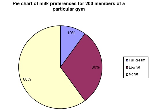
Important note: the fancy three-dimensional and exploded pie charts available in Excel should be avoided. These tend to distort the view of the relative sizes of categories and so violate principles of graphical excellence (see discussion later).
Bar charts and grouped bar charts
In a bar chart, each category is represented by a bar, the length of which corresponds to the frequency (or percentage) for that category. It is different from a histogram (discussed later) in two important ways:
- in a bar chart identification of each bar is qualitative (categorical) data whereas in a histogram it is quantitative (numerical) data and
- the bars on a bar chart must have a gap between them whereas on a histogram the bars must touch.
When the categories are number based (such as, yearly sales figures, response to a survey question using a five-point scale, etc.) the bars are usually vertical with labels across the x-axis. When categories are word-based (such as, in the milk preference example) the bars are usually horizontal with labels up the y-axis.
A bar chart might be preferred to a pie chart where you were most interested in comparing categories. Bar charts can be based on raw frequencies or percentages, depending on the situation and on the purpose of the graph.
Returning to the milk preference example, and using the frequencies, the following bar chart was produced (using Excel). Note how the bars are plotted horizontally.
Bar chart of milk preferences for 200 members of a particular gym
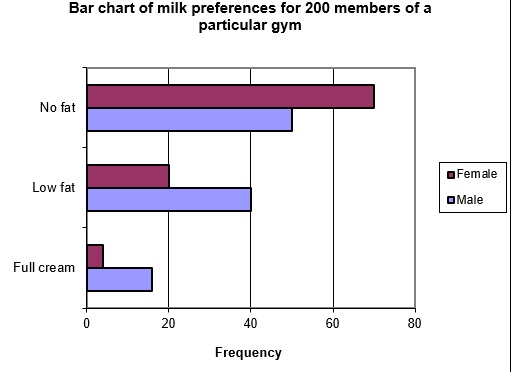
Grouped bar charts (also called side-by-side or multiple bar charts) have multiple bars within each category. For example, in the milk preference example, we might divide each bar into male and female gender of people. If the results were examined again, and the following table now summarises milk preferences, then the grouped bar chart below would be the result.
|
Milk preference |
Total frequency |
Male |
Female |
|
Full cream |
20 |
16 |
4 |
|
Low fat |
60 |
40 |
20 |
|
No fat |
120 |
50 |
70 |
Note that in this example, the comparison might have been better made using the relative frequencies within each category.
Pareto charts
A Pareto chart is essentially a vertical bar chart with a couple of additional features. Firstly, categories are ordered from most to least frequent, and secondly, a cumulative percentage line is included on the same chart.
Pareto charts are commonly used in Total Quality Management (TQM), where a key consideration is the search for causes of problems in products and processes. Pareto analysis involves tallying the number and types of defects which occur with a particular product or service. The resulting data is displayed using a Pareto chart.
In practice, it is often the case that only a few categories are responsible for most of the problems. Pareto charts make it easy to distinguish between categories with larger numbers from small occurrences, and allow the separation of the ‘vital few’ from the ‘trivial many’ categories. The ‘80/20 rule’ says that about 80 percent of the quality problems can be attributed to only 20 percent of the categories. In other words if you want to improve quality you should identify (and hopefully solve) the ‘vital few’ problems. Solving ‘trivial many’ problems is far less likely to result in a significant improvement to your quality and processes.
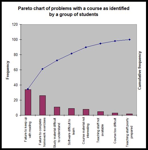
We will illustrate Pareto charts using a slightly more complex data set than our milk preference example. A group of students were asked for their views on a particular unit. Those who had struggled with the unit identified a number of perceived problems with the unit structure, material and teaching. The following table summarises these results, by listing the problems identified and the number of times each problem was identified.
|
Frequency |
Problem |
|
34 |
Failure to keep up with reading |
|
2 |
Teaching staff poorly prepared |
|
26 |
Failure to complete required homework exercises |
|
3 |
Unit too difficult |
|
9 |
Computer software difficult to learn |
|
8 |
Unit material is not interesting |
|
5 |
Teaching staff not available when needed |
|
11 |
Study Guide and textbook difficult to understand |
|
98 |
Total |
The first step in producing a Pareto chart is to order categories from most to least frequent (see table below). Then, to produce the cumulative percentage curve, we need to calculate the relative frequency of each category and then, from this, the cumulative relative frequency. The relative frequency is found by dividing the frequency by the sum of all frequencies. For the first category this means (to 6 decimal places) and then expressing this as a percentage (34.6939%). Similarly for the second category we find . See the table below for the remaining values. The tables in the cumulative column are found by adding each new category to the running total. For example, the two most common categories account for of the problems.
|
Problem |
Frequency |
Relative frequency (%) |
Cumulative relative frequency (%) |
|
Failure to keep up with reading |
34 |
34.6939 |
34.6939 |
|
Failure to complete required homework exercises |
26 |
26.5306 |
61.2245 |
|
Study Guide and textbook difficult to understand |
11 |
11.2245 |
72.4490 |
|
Computer software difficult to learn |
9 |
9.1837 |
81.6327 |
|
Unit material is not interesting |
8 |
8.1633 |
89.7960 |
|
Teaching staff not available when needed |
5 |
5.1020 |
94.8980 |
|
Unit too difficult |
3 |
3.0612 |
97.9592 |
|
Teaching staff poorly prepared |
2 |
2.0408 |
100 |
|
Total |
98 |
100 |
Next, a vertical bar chart is produced with the frequency on the left-hand y-axis and the cumulative percentage on the right-hand y-axis. The default graph produced by Excel needs a little work to ensure that it meets standards of graphical excellence. A slightly modified graph is given below. Note that category names have been abbreviated in some cases to assist in making the graph more readable. This needs to be done with extreme care, however, so that it does not cause the loss of vital information contained in the category descriptions.
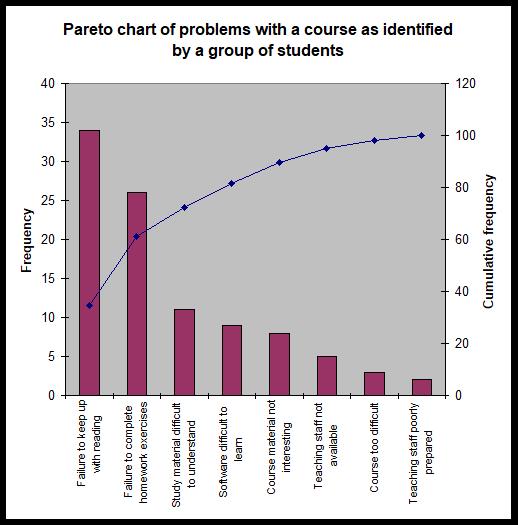
Note that this example is one where the 80/20 rule does not perfectly describe the behaviour of the data. It is clear that 80% is not reached until the fourth category. It is also clear, however, that most of the problems identified relate to the first two or three categories.
Some texts recommend creating Pareto charts so that the 100% value on the cumulative frequency axis lines up with the total frequency on the frequency axis. This causes the cumulative curve to rest on top of the first bar and proceeds upwards from there. The Pareto chart using this format would look as follows, but the problem with this is that the bars can be too short to understand the differences in heights amongst them. Therefore, it is recommended that you use the primary axis for Frequency and the secondary axis for Cumulative frequency.
|
Example 2–1 A DVD hire company deals with a number of complaints regarding their rental DVDs. The number of times each complaint occurred is given in the table below.
Using this data: a) construct a pie chart b) construct a bar chart c) construct a Pareto diagram d) which graphical method do you think is best to portray this data? e) based on the results of (a) through (d), what conclusions can you make concerning the most common complaints at the DVD hire company? |
Graphical displays for quantitative data
With the graphical displays discussed until now, the data was qualitative (in terms of categories such as no fat milk, low fat milk, etc.). They related to frequencies of occurrence of various word (or discrete number) categories. Often, however, data comes to us as just raw numbers, such as daily sales figures, weekly petrol costs, the salaries of the employees of a firm or the cost of an identical basket of goods from various supermarkets. Different graphical displays are used to summarise quantitative data. We will examine a few of these here.
Stem-and-leaf diagrams (stemplots)
Stem-and-leaf diagrams are a quick way to organise data into groups. They were designed to enable this to be easily done by hand, but Excel/KaddStat (and other software) also allows this to be done quickly. For smaller data sets, they are particularly useful as an alternative to a histogram. The digits of the data values are separated into a stem and a leaf. For example, if we had a data value of 49, we might make the 4 the stem and the 9 the leaf. When there are more than two digits in the numbers, the decision on how many significant digits to keep depends on the type of data and the choice of the person producing the graph, the leaf however is always a single digit number. The goal is to find a balance between too many and too few categories, by choosing stems and leaves appropriately. See the discussion below for some pointers on how to make those choices. But first, let’s look at a simple example.
Twenty office workers are randomly selected, and their weekly spending on newspapers is recorded with the following results (expressed in whole dollars):
|
0 |
10 |
45 |
30 |
65 |
80 |
14 |
18 |
21 |
39 |
|
54 |
8 |
26 |
28 |
36 |
41 |
5 |
12 |
14 |
19 |
The first step in creating the stem-and-leaf display is to order the data from smallest to largest (called an array):
|
0 |
5 |
8 |
10 |
12 |
14 |
14 |
18 |
19 |
21 |
|
26 |
28 |
30 |
36 |
39 |
41 |
45 |
54 |
65 |
80 |
This data consists of one or two digit numbers, so we can chose the first digit as the stem and the second as the leaf. For the one digit numbers, the stem would be 0 and the leaf would be the digits we are given (0, 5 and 8). We can see that the smallest stem will be 0 (from data value 0) and the largest will be 8 (from 80).
We would then write these values down the side of the page as follows:
|
0 | ||||
|
1 | ||||
|
2 | ||||
|
3 | ||||
|
4 | ||||
|
5 | ||||
|
6 | ||||
|
7 | ||||
|
8 |
Now we can begin to add the leaves one by one. The first data value is 0, so we should add a 0 to the right of the 0 stem. Then for 5, we add a 5 next to the 0 stem etc.
|
0 |
0 |
5 | ||
|
1 | ||||
|
2 | ||||
|
3 | ||||
|
4 | ||||
|
5 | ||||
|
6 | ||||
|
7 | ||||
|
8 |
If we continue in this fashion for the remainder of the data set, the following stem-and-leaf diagram will result: (Note 7 must be written in the stem for continuity though there is no data in the 70s.)
|
0 |
0 |
5 |
8 | |||
|
1 |
0 |
2 |
4 |
4 |
8 |
9 |
|
2 |
1 |
6 |
8 | |||
|
3 |
0 |
6 |
9 | |||
|
4 |
1 |
5 | ||||
|
5 |
4 | |||||
|
6 |
5 | |||||
|
7 | ||||||
|
8 |
0 |
Choosing stems and leaves for messy data
There are many cases where the data do not lend themselves so neatly to stems and leaves. For example, for data such as 0.0149, 394.235 or 190 653 we cannot simply choose the first digit as the stem and the next as the leaf—we would lose too much information.
Often there are a number of ways we could make the choice and still end up with a nice stem-and-leaf plot. We need to choose stems in such a way that we have enough to see the shape of the data set without spreading the data into so many categories that we lose all the information. Anything from about 5 to 15 stems is appropriate depending on the size of the data set. Generally, small data sets need fewer stems and larger data sets need more. You should never have a stemplot that spans more than one page, that would defeat the purpose.
Let’s demonstrate using some examples.
- Given the following data values (a subset of a data set): 0.0149, 0.9832, 0.2532, 0.4501, 0.7019, … it might be sensible to round the numbers to two decimal places, use the first digit after the decimal point (0, 9, 2, 4, 7, …) as the stem, and the second digit as the leaves (1, 8, 5, 5, 0, …).
- Given the following data values: 394.235, 388.583, 392.891, 393.998, 397.852, … it might be sensible to round the number off to one decimal place, use the first three digits as the stems (394, 388, 392, 394, 397, …) and digit after the decimal point as the leaf (2, 6, 9, 0, 9, …). Note how the rounding has affected these values (for example 393.998 rounds to 394.0). Note that the range of stem is from 388 to 397, which would give you ten rows. If the range is higher, you will have too many rows, and then, you have to reduce the number of significant digits.
- Given the following data values 190653, 121987, 154028, 161923, … it might be sensible to round the numbers to three significant figures (so 190653 would become 191000, 121987 would become 122000, 154028 would become 154000 and 161923 would become 162000, …), use the first two digits as the stem (19, 12, 15, 16, …) and the third digit (the third significant figure) as the leaves (1, 2, 4, 2, …).
- Please note that the leaf is always a single digit whereas the stem may have more than one digits. The number of rows however should not exceed 15.
Frequency distribution and frequency polygon
A stem-and-leaf display (or stemplot) is not suitable when the dataset is large. A frequency distribution then is a way of summarising numerical data in the form of class intervals and frequencies, which can provide at a glance the distribution of the data. The graph produced by plotting the frequency distribution is called a frequency polygon when the type of plot is a line graph, or histogram when the type of plot is a bar graph. In order to produce a frequency distribution, you must first decide how many classes are required and then establish the boundaries of each class.
Classes and boundary points
Usually between 5 and 15 classes are used, but the exact number depends on the size and type of data you have, and also depends on the statisticians’ judgement. Selecting too few or too many will result in a loss of useful information (particularly when graphed). Some statistician’s use Sturge’s formula to determine the number of classes, which is
where K is the number of classes and N is the number of observations. Once the number of classes is chosen, the following formula can be a useful in determining the width of each class interval:
The range is found via: .
Returning to the example of the amount spent on newspapers, let’s say we wanted to establish a frequency distribution with 8 classes (Sturge’s formula would give 1 + 3.3×log20 = 5.29 or 5 classes). We find that the range is . The interval width would therefore be . The first interval will have a lower bound equal to the first data point and an upper bound of the first data point plus the interval width: . So that the next class does not include the value 10 as well (the classes cannot overlap), we will say that the first class is ‘0 to less than 10’. The second class will therefore be ‘10 to less than 20’ since we add another class width of 10. See the table that follows for the remaining classes. Note that in this case we have been forced to add another class to include our maximum data value, since it would not be included in the eighth class ‘70 to less than 80’ (it is not always necessary to do this!). Also, you can write a class as [10, 20) instead of ‘10 to less than 20’. ‘[’ indicates a closed boundary which means 10 is included in the class and ‘)’ indicates an open boundary which means 20 is not included but 19.99999999... is included.
Sometimes using the class width and boundaries found with the formula above can end up being quite messy (for example, it may give awkward endpoints). When doing this by hand we should try to use nice round boundaries wherever possible (this may require going below the lowest value and above the highest value). We might use the calculated class width and endpoints values as a starting point, rounding them to more workable numbers. So, for example, if the range was 30 and the number of intervals chosen was seven we would get a class width of 4.2857142857… we might choose to round this to one decimal place, 4.5. The rule for calculating boundaries should be viewed as a rule of thumb (a guide), not as absolute law. As always, it’s important to use your common sense.
Tallying
Once class intervals are established, the next step is to determine the number of data values that fall within each class. Using tally marks is a simple way of doing this. Normally we mark with a diagonal line up to four times and on the fifth we put a line through the preceding four values like this: ////. We then start a new set of diagonal lines. So, for example, if we had //////// // we would know that there were 12 (5+5+2) data points in that class. In this way we can quickly look at the category and easily see how many values have fallen in that class. Completing the tally for our newspaper spending example, we find the tally values as given in the table which follows.
Frequency distribution
The frequency column in the table below summarises the values in the tally column. The tally column is not a necessary part of a frequency distribution, but it is helpful when doing this by hand. (You cut out a number as you put the tally for that number.). The frequency distribution consists of just the class and frequency columns of the table.
|
Class |
Tally |
Frequency |
|
0 to less than 10 |
{`///`} |
3 |
|
10 to less than 20 |
{`//// /`} |
6 |
|
20 to less than 30 |
{`///`} |
3 |
|
30 to less than 40 |
{`///`} |
3 |
|
40 to less than 50 |
{`//`} |
2 |
|
50 to less than 60 |
/ |
1 |
|
60 to less than 70 |
/ |
1 |
|
70 to less than 80 |
0 | |
|
80 to less than 90 |
/ |
1 |
Class midpoints
Class midpoints (sometimes called class marks) are the midpoint of each class interval. They are exactly halfway across the class interval and are calculated as the average of the two class endpoints. In our example above, the midpoint of the first class is halfway from 0 to 10, or in other words 5. The remaining midpoints will therefore be 15, 25, 35, 45, 55, 65, 75 and 85.
Frequency polygon
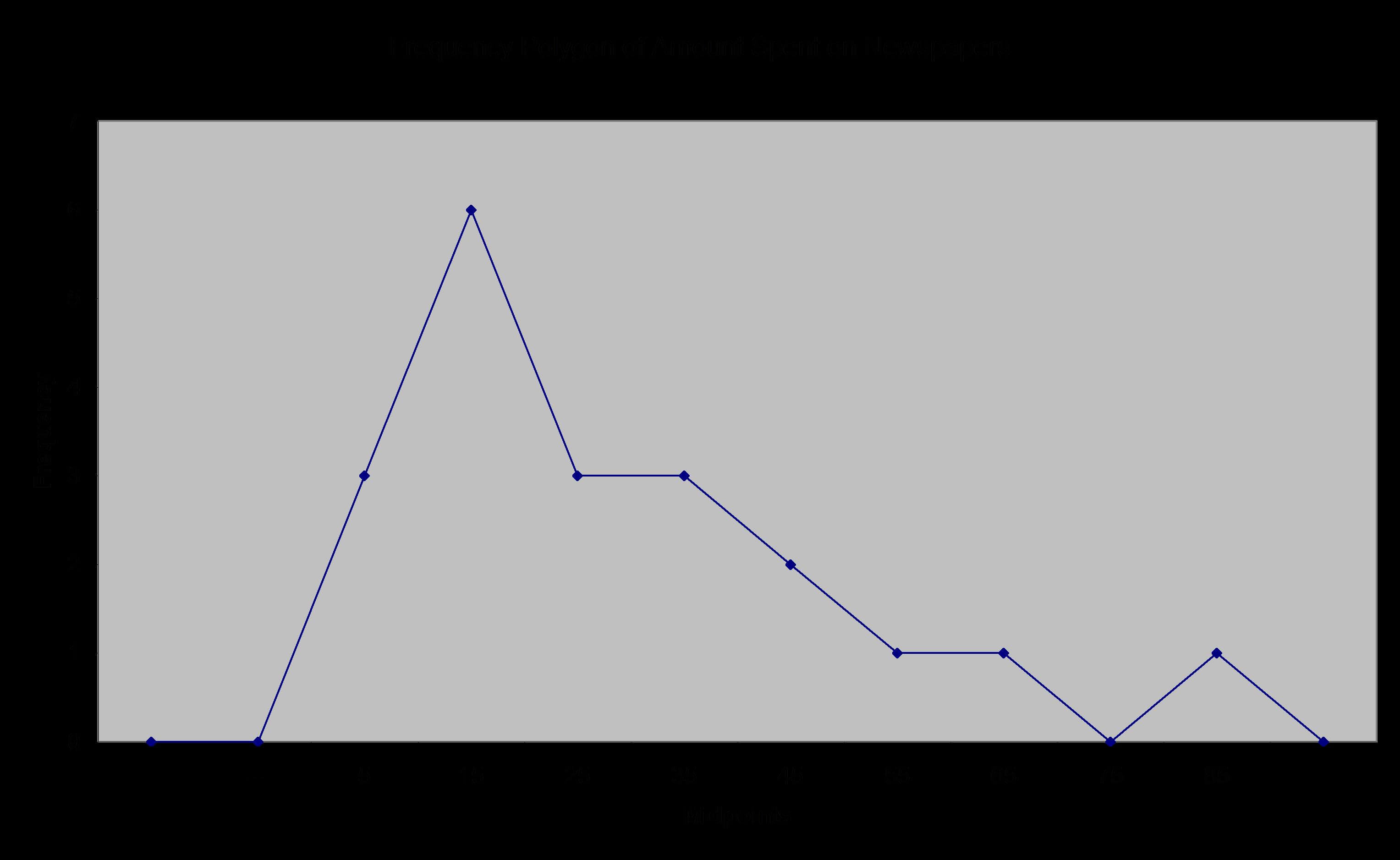
A frequency polygon is simply a line graph of the frequency distribution values. For the newspaper spending example, the following frequency polygon is produced. Note how the graph is closed at the end with imaginary classes with zero values. Note the frequency polygon in Figure 2.5 on page 28 of the textbook is incorrect. Polygon means a closed space with straight edges. Unless you close the ends to touch the x-axis, it is not a polygon, rather a line graph.
Ogive
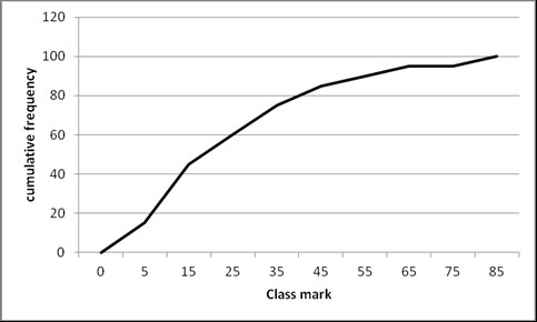
An ogive (sometimes called a cumulative percentage curve or cumulative relative frequency curve) is a graph of the cumulative frequency distribution. For the newspaper spending example, we find the following:
|
Class |
Frequency |
Relative frequency (%) |
Cumulative relative frequency (%) |
|
0 to less than 10 |
3 |
15 |
15 |
|
10 to less than 20 |
6 |
30 |
45 |
|
20 to less than 30 |
3 |
15 |
60 |
|
30 to less than 40 |
3 |
15 |
75 |
|
40 to less than 50 |
2 |
10 |
85 |
|
50 to less than 60 |
1 |
5 |
90 |
|
60 to less than 70 |
1 |
5 |
95 |
|
70 to less than 80 |
0 |
0 |
95 |
|
80 to less than 90 |
1 |
5 |
100 |
|
Total |
20 |
100 |
The ogive based on this data is as follows.
Histograms
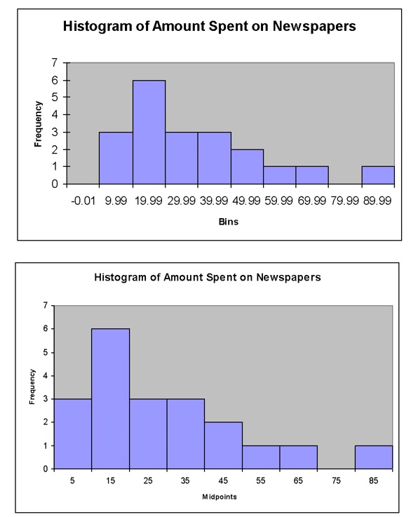
A histogram is a chart which uses vertical bars to display the frequency distribution. Unlike a bar chart, which is used for qualitative categories, the histogram is used for quantitative categories. This means that the bars on a histogram must touch to indicate the continuous nature of the data. Also, histograms always use vertical bars, unlike bar charts where the bars can be vertical or horizontal. A histogram is preferred to a stem-and-leaf diagram when data sets are larger. A stemplot can maintain the original values of a dataset, whereas a histogram cannot, but a stemplot cannot handle a large dataset.
The histogram for the newspaper spending example follows. Notice how the graph produced by an add-on to Excel uses the messy bin values on the x-axis. It is possible to use Excel to produce a histogram using the midpoints (see below).
|
Example 2–2 The following data represent the actual weight of potato chips found in bags labelled 50 grams. The manufacturer aims to overfill the bags by 5 grams to allow for settling and dehydrating of the chips prior to sale. The results of fill weights in a sample of 20 consecutive 50-gram bags are listed below (reading from left to right in the order of being filled):
a) Construct a stem-and-leaf display. b) Construct the frequency distribution and the relative frequency distribution. c) Plot the histogram. d) Plot the relative frequency polygon. e) Form the cumulative relative frequency distribution. f) Plot the cumulative relative frequency curve (Ogive). g) On the basis of the results of (a) through (f), does there appear to be any concentration of the bag weights around specific values? h) If you had to make a prediction of the weight of potato chips in the next bag, what would you predict? Why? |
Scatterplots and times series plots
A scatterplot is a graph of two variables, which allows a visual check for any relationship between the variables. For example, you might graph quantity of goods sold on the x-axis and profit earned on the y-axis. This would allow you to study the relationship of profit to number of goods sold. Scatterplots produced by hand would normally use a ‘×’ symbol for each data point, but software (such as Excel) uses a variety of symbols. We will illustrate with a simple example. The following data is the quantity of mobile phones sold and the corresponding daily profit for a small phone sales shop for a random sample of 10 days. The scatterplot of this data follows.
|
Quantity of mobiles sold |
Daily profit ($) |
|
12 |
500 |
|
19 |
690 |
|
8 |
380 |
|
11 |
430 |
|
24 |
900 |
|
16 |
750 |
|
22 |
1100 |
|
15 |
780 |
|
12 |
560 |
|
9 |
480 |
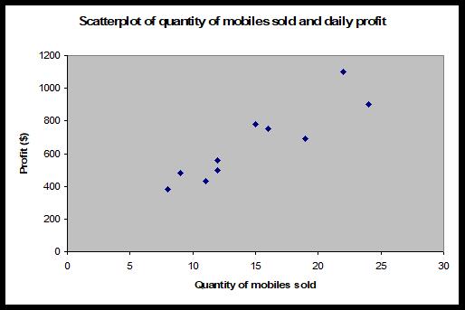
A time series plot is used instead of a scatterplot where one of the variables involves regular time intervals. In this case, the researcher is interested in the behaviour of a particular variable over time. For example, ‘are profits increasing?’, ‘has the price of a share decreased over the last year?’ or ‘have daily customer numbers stabilised at a particular restaurant?’. With a time series plot, the time variable is always plotted on the x-axis and the variable of interest (profit, share price, customer numbers, etc.) on the y-axis. The following example illustrates a time series plot.
|
Example 2–3 In recent years, the cost of holiday accommodation on a particular island has been increasing. There was, however, a reduction as a reaction to reduced air travel in the aftermath of the attacks of September 11, 2001. Since then, rising fuel costs have increased the cost of commercial flights and so further discouraged travel to the island, but despite this, the cost of accommodation has continued to increase. The following data represents the cost of a double room for one night’s accommodation on the island for the years 1995 to 2006.
a) Set up a time series plot (with cost of the double room on the y-axis and year on the x-axis). b) Based on the results of (a), is there any pattern to the cost of the double room between 1995 and 2006? |
Important graphical considerations
As we said in the introduction of this chapter, producing accurate graphs is something that many people struggle with. It is very easy to produce graphs that look good, but that could violate some important principles. We’ll start by offering a list of suggestions on what to do to produce reliable and accurate graphs, then talk about some commonly made errors and finally consider ethical issues.
Graphical excellence
A good graph should always include the following:
- A clear, meaningful title—the title should describe not only the type of graph (e.g., histogram, pie chart, etc.) but also what the graph is showing (daily profit at a restaurant, amount spent on newspapers, etc.).
- Appropriate axis labels or a legend—the choice of axis labels or a legend will depend on the type of graph used (and the kind of data) but, a descriptor of the variable on each axis or a legend to distinguish between multiple variables (or sometimes both) is essential.
- The graph should be able to stand on its own. A good graph should include enough information so that it can be viewed and understood without the need for further explanation. Usually, in a statistical report, a graph will also be discussed, but it is important that this is not used as a means to explain the graph. Discussion of graphs is normally for the purpose of interpretation of the results presented in the graph, rather than explanation. A meaningful title and axis labels or a legend will obviously assist with producing a self-explanatory graph.
- Show the data clearly. It should display complex information in a simple and precise manner.
- Focus the viewer on the substance of the graph.
- Encourage comparisons of data. Graph of a single variable is not of much use.
- Serve a clear purpose.
- Tell the truth about the data. Aside from the (obviously essential) need to present the correct data, it is also important to avoid presenting the data in such a way that the viewer is misled as to the truth.
- The graph should not distort the data. Many fancy graphical displays (such as many of those available in Excel) tend to distort data. For example, using three-dimensional pie charts is likely to overemphasise the important of categories at the front of the graph and underemphasise those at the back. The textbook also contains examples of graphs that distort results.
- Avoid chartjunk. Chartjunk is unnecessary information or adornments that clutter the graph. A good rule of thumb is to keep the graph simple.
- Maximise the data-ink ratio. The data-ink ratio is the proportion of the graph’s ink that is used for display of useful information.
- Avoid too much white space. The actual graph (a pie chart, a bar chart, etc.) should take up the majority of the space allocated for a graph. Too much empty space (white space) around a graph is distracting, unnecessary and lessens the impact of the actual graph.
- Include zero on the y-axis. Truncating the graph so that the vertical axis does not begin at zero can distort results, overemphasising differences between data values. It may be necessary sometimes, but should be done carefully so as not to mislead the viewer.
- Avoid using pictures instead of rectangles in bar charts etc. Often if a picture is used instead of a bar chart, the reader will interpret the area (or volume) of the picture rather than the height. This can also distort results or overemphasize bigger frequencies. See the text for some examples. Find below, the Minard’s graph, which is considered as one of the best graphs ever produced. It charts Napoleon’s invasion and retreat from Russia in 1812. It captures 5 variables.
Common graphical errors and ethical issues
The textbook contains a number of examples of poorly presented graphs. Graphs can mislead viewers by being emotionally charged. At times there is a clear intention to mislead the viewer. Violating the guidelines above are some of the most common ways of making errors. A desire to make a graph look attractive must always be balanced with the need to clearly and accurately display the data. Too often, graphics used in the media, focus solely on pretty presentations at the expense of accuracy.
An ethical issue arises when someone intentionally uses a graph to mislead the viewer. In many cases, graphs are poorly produced more from ignorance of the statistical considerations, rather than as an intentional tool to mislead. Packages such as Excel have not assisted in improving graphical excellence, where many of the graphical types available which contain unnecessary adornments or which distort results. In many cases, default graphs require a fairly large expenditure of time to adapt them to an appropriate format and avoid graphical errors. Unfortunately, Excel’s graphical features do not appear to have been designed by statisticians. There are, however, many other statistical packages available, which significantly outperform Excel in producing good quality graphics.
The commercial need to produce a colourful and nice looking report may sometimes contradict with the statistical need to be accurate.
Discussion points
|
Discussion point 2–1 Examine ‘Ethical considerations in presenting annual profits for a company – the y-axis does not begin from $0; only years where profits were made are displayed; to hide losses, profits are averaged over several years; etc. Discuss your answers. Are there any ethical issues associated with these graphical displays? Give an example of how such displays could potentially be misused. What have you learned about graphical excellence? Look carefully at Minard’s graph. |
Summary
Now that you have completed this module, turn back to the objectives at the beginning of the module. Have you achieved these objectives?
Ensure that you attempt the recommended problems in the list of review questions below and at least a sample of problems from the optional list. This will help you to identify any areas of difficulty you have in achieving the module’s objectives.
Review questions
|
Recommended problems Black et al., Review Problems. (Page 55): Problems 2.2, 2.4, 2.5, 2.8, 2.12, 2.14. Optional problems Black et al., Review Problems (Page 55): Problems 2.1, 2.6, 2.9, 2.10, 2.13. |
Tutorial and Workshop
|
Workshop Watch the following video on how to convert texts into workable Excel data: https://www.youtube.com/watch?v=37kwwEeFKvY Watch the following video on how to create a histogram in Excel: https://www.youtube.com/watch?v=asEuFvWGJDs After watching the videos practice doing it yourself. Tutorial Solve the recommended problems under Review questions. |

